Preface
It was March 2019 when a co-founder and proprietor of Stutern1 approached me. He wanted me to lecture his graduate interns on Identifying Good (and Bad) Design.
While contemplating how to structure my lecture for suitability and impact, I found the rather persnickety part of me filling my head more with a sea of "bad" designs or my idea of what may be regarded as such than the ones I favor as good.
Incidentally, I say suitability because the program mainly focused on software interface design, even if this very much is design, all design principles equally applying, albeit intangible and updatable - a bonus.
Reasoning into Principles
I reasoned that my lecture would make more impact and it itself benefit from its own dog food - be timeless - if it instead taught how to identify good design with specific criteria. Any design not meeting a few or most of these criteria would be considered bad. To quote Don Norman2 loosely - only when you learn what is "correct" can you tell/understand how what is "wrong" is wrong or bad.
So, word after word, I started jotting down these criteria.
They were individual words that explained what the human sensibilities detect or fail to pick up in whatever they experience. They were words I had played with in my head after many years of theorizing in design, without having to necessarily do any myself. They were words I had used to judge people's designs.
Words that sometimes left me bitter when I looked at roads, automobiles, buildings, interiors, cooking utensils, toothbrushes, toothpaste tubes, yes, simple and complex things, really, everything including people's utterances, and, for suitability to my immediate concern then, software applications on mobile or desktop computers.
Decision to Publish Principles
I therefore decided to present these words as principles, elucidate on them, give practical examples, and conclude it was enough to merely look out for these when designing or critiquing a design. These were timeless facets of any good design.
It would be needless to even present any examples of bad design to them. They would be able to come to their own conclusions when these words made sense to them. And, thus, they may wow the world with great software interface designs.
These words have become Good Design Is.
Illustrating the Principles of Good Design Is
The following graphic shows how I originally illustrated them. I have since stuck with this manner of showing them off since it forms what I have also called "The Spiral of Good Design." This latter name would have made the book's title. But I went with Good Design Is so it would read into each word/principle/facet.
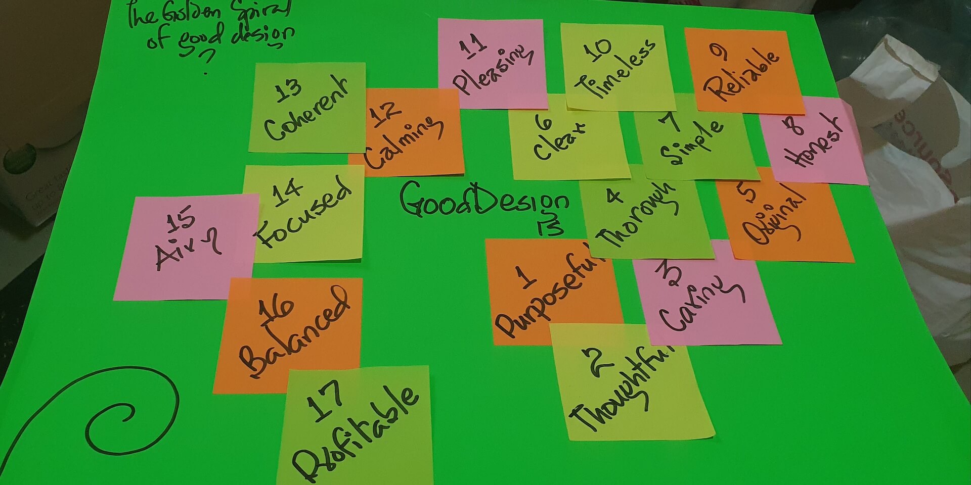
I also toyed with "The Golden Ratio of Good Design"3 because, like every designer, I, too, am fascinated with composing elements for the most aesthetic appeal to sensibilities. Again, for good measure, I stuck with "Good Design Is."
- Stutern is a graduate accelerator that trains interns in job-relevant skills on a deferred-tuition model and subsequently pools these graduates for interested employers from especially the technology industry to hire them.↩
- The Design of Everyday Thing by Don Norman↩
- What is the golden ratio? What you need to know and how to use it↩